The first time he tried to kill red, he brought a box cutter. The wounds were almost fifty feet long combined—clearly, he didn’t want to leave anything to chance. Not that the failed painter Gerard Jan van Bladeren had much of a plan when he visited Amsterdam’s Stedelijk Museum in the spring of 1986, but later, when asked why he’d done it, he was emphatic about hating abstract art. He seems to have hated it for the same reasons that lots of people do: it was lazy, childish, ugly, offensively simple, meant nothing beyond what it literally was. Which, given that the canvas he chose—Barnett Newman’s “Who’s Afraid of Red, Yellow and Blue III”—is literally a hundred and forty square feet of red oil paint, flanked by two thin stripes, would mean that it was red, pure red, he was slashing.
The trial was national news. Van Bladeren’s lawyer, a pioneer of the “relax, it was just performance art” defense, insisted that the attack had been a creative act which the painting itself had provoked. Red, in other words, was asking for it. Van Bladeren was sentenced to five months in jail plus parole—not bad for attempted murder—and the world soon moved on to a million other things.
The 100th Anniversary IssueSubscribers get full access. Read the issue »
There seems to be no reason that the would-be performance artist had to single out red to make his point—but people tend to do that, don’t they? Red is the color we wear when we want to be noticed, the one that appears in the most national flags, the one that casinos and advertisers use to loosen wallets. The science is in on that: red quickens the pulse and sticks in the memory as no other color does—an echo, probably, of a time when detecting blood and ripe fruit was a more pressing evolutionary concern. Anthropologists tell us that most of the world’s cultures had a word for red before they got around to blue or green or yellow, which helps explain why so many non-red things, from onions to hair, have ended up with the name anyway. In Castilian Spanish, colorado means “red” but translates to “colored,” as though the visible spectrum had one part instead of many. Red is the first color, the strongest color, the one that stands for color itself.
We notice things before we know what we think about them. First our hearts beat faster, then we tell ourselves why. Van Bladeren noticed Newman’s red and decided that he hated it; another museumgoer said that it made her sick; others have said that it filled them with joy. They’re all just feelings, grounded in nothing but more feeling, but can we do any better? The only good way of talking about red may be talking around it.
The difficulty, as you may once have mused between puffs, is not that red is hard to define—it’s the color that corresponds to electromagnetic radiation with wavelengths from roughly six hundred to seven hundred and fifty nanometres—but that this definition happens to be useless. We look at a red framed by canary yellow and call it dark; we look at a red framed by midnight blue and call it light. By the end of the first page of the 1963 classic “Interaction of Color,” the artist-theorist Josef Albers has already gone for the deepest version of the problem: even when we’re all staring at the same shade of red, we have no way of staring into one another’s heads to confirm that we’re processing it the same way. To return to that definition, the word “corresponds” is the catch, but also the fix; unable to explain our response directly, we are reduced to saying that red corresponds to “warm” or “hot” or “loud,” that it evokes an apple or a ruby or sunrise.
As Michel Pastoureau notes in his wonderfully rereadable “Red: The History of a Color” (2017), antiquity had the same problem: Individual things could be red, but what could be said about the color itself? Or, to put it another way, “What is ‘RED?!’ ” For one, it’s the name of a John Logan play in which Mark Rothko hurls this very question at his assistant, Ken. A few beats later, they’re both rattling off reds, each one valid but incomplete. Ken’s examples skew cheerier—tulips, Dorothy’s slippers, a rabbit’s nose—while his boss goes for lava, guts, the Nazi flag. Logan’s play is about a man who can talk with scientific precision about the nuances of color, and even he has to tell stories about red, build an entire mythology around it, complete with good and evil and end-times. “One day,” Rothko says, “the black will swallow the red.”
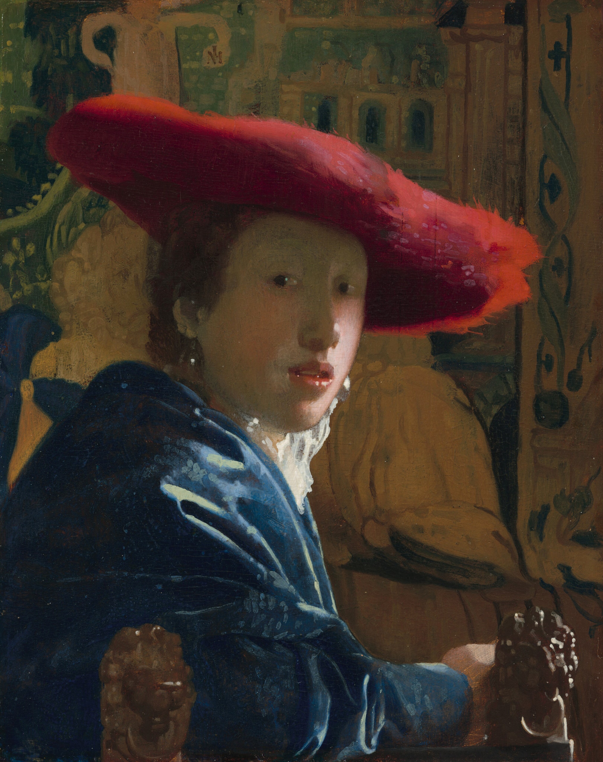
The questions go on and on, but they needn’t cause a headache—you can bask in them. Vermeer did: his “Girl with the Red Hat,” completed around 1669, might be my favorite red painting. Not the best use of the color, exactly; I mean the painting that is most delighted and perplexed by red, or delighted by its own perplexity. Vermeer didn’t choose the title, but it’s the one posterity has settled on, the one you find when you visit the work at the National Gallery of Art, in D.C. Posterity could have gone with “Girl with the Blue Robe” or “Girl with the White Cravat” instead—but, then, if you knew nothing about it, you would say it’s a painting of a girl in a red hat, too.
Can we be any more specific about who she is? It may be the defining quality of Vermeer’s work that we cannot but feel that we should try. To start with, “Girl with the Red Hat” was not intended to be a portrait of any specific person; it’s an image of a type. Art historians will tell you that this genre, popular in the Dutch Golden Age, is called tronie—you’re supposed to be looking not at an individual old man but at old man-ness, not at a soldier but at soldier-ness, not at a girl but at girl-ness. Clearly, though, this is also a record of one specific person. The glare on her earrings, the flush of her cheek, the parted lips, and the arrested momentum of her right shoulder are too precise—someone sat for hours or days or weeks while Vermeer transferred her face to the wood panel where it now rests. She has survived the past three and a half centuries, but not quite as herself.
So it’s fitting that the girl’s red hat, not her face, is the painting’s real center of gravity. Red, not blue or black or gray—the painting would lose half its mystery if the hat were a more stereotypically mysterious color. A red hat makes the girl more specific, hence the title, even as it makes her more of a blur. Sitting for a portrait you’ve paid for, you can dress in your own clothing—fancy clothing that you don’t often wear, maybe, but still yours. For a tronie, the model wears whatever the painter requests. This red hat doesn’t belong to its wearer in any but the loosest semantic sense—it’s too bold for her, too big, too rich, too much. The girl whispers; her hat yells. Yet what’s true of the color goes for the girl: there seems to be something extra vivid about her, but as soon as you try to articulate it your hands tighten around air.
Enough zooming in—let’s zoom out. The hundred and twenty-three works in “Seeing Red,” a handsome show at the Nassau County Museum of Art which closed a few weeks ago, included portraiture, lacquer, sculpture, and fashion. Albers, the color guru, was represented with a selection of early-seventies screen prints; there were New York abstractions by Rothko and both de Koonings, a nineteenth-century still-life with a lobster, a Warhol silk screen of (who could be redder?) Lenin, a 1988 faux Fabergé egg choking on its rhinestones. Over all, a representative sample of how unrepresentative our view of red really is.
Nonsensical, too: for every myth we tell about red, Pastoureau suggests, there is an equal and opposite myth. In the Western world alone, it is the symbol of the Devil but also of Christ the martyr, love, danger, and clown-and-balloons innocence. If you stayed awhile at the Nassau show, however, the myths started sorting themselves out. Red was the color of authority thousands of years ago, e.g., and remains so—it’s the traffic light commanding you to brake and the teacher’s pen commanding you to rewrite, the king’s robes and the C.E.O.’s Ferrari and the Pope’s shoes. Who wields the authority always changes, but the basic iconography endures. In “Seeing Red,” two pictures by Gilbert Stuart, the premier portrait painter of the early United States, suggest that even something as seismic as the American Revolution left red’s prestige untouched. In one, the Boston commoners Barney and Ann Smith might as well be English nobles for all the red drapery surrounding them. In Stuart’s most famous portrait, of George Washington, we see the same décor—His Excellency was willing to surrender executive power but not the power of a good, luxuriant crimson.
The more surprising thing about “Seeing Red” was how little red it contained. Yes, there were many images in which red was the most used or even the only color; there were plenty more, though, in which red was merely one of several colors on display—Alexander Calder’s “Stars,” or Alfred Jensen’s “Magic in Egypt”—or in which a red object, be it lobster or handprint or flower, was a tiny, bright island in a darkish sea. Most surprising of all, maybe, was Graham Nickson’s “Serena’s Tree: Red Sky,” which has buckets of blue, green, purple, yellow, pink, and orange, but only a few dribbles of the color the title promises.
The obvious way to interpret all this would be as a sign of red’s power: it doesn’t require much in the way of square footage to rule whatever image it’s in. And that obvious interpretation is correct, but still points to something less obvious: in visual art, red is a wonderful scene-stealer but rarely the scene. It is often a figure or the figure but, even in a whole show about it, only intermittently the ground. (Henri Matisse’s “The Red Studio” might be the most famous exception, though it’s sort of telling that the artist half acknowledges his faux pas by depicting various non-red paintings within the painting.) Compare “Seeing Red” with “Infinite Blue,” another single-color showcase, which filled most of the first floor of the Brooklyn Museum a few years ago. Blue was equally at home as the ground and the figure in that exhibition’s works, some of them abstractions, some landscapes, some religious scenes. In many of the cases from “Seeing Red” where red does dominate, the work in question comes off as an affront, crossing some chromatic line—look at Warhol’s “Red Lenin” or STIK’s “Liberty (Red)” and feel the wet raspberry splatter you. Or consider Rashid Johnson’s “Untitled Anxious Red Drawing” (completed in 2020, the most anxious year in recent history). Like “Girl with the Red Hat,” it depicts the human face—crude, mindless faces with circles for eyes and lines for mouths, but still. This time, though, there’s no whispered mystery. Each face is smothered in lines before it can say or do anything: the red oil stick’s slug trail is laid on so thick and wide that foreground merges with background and makes for one optical onslaught, evoking as many kinds of pain as you can stand to imagine.
We obsess over red. Evolution has trained us to bow before it. “Seeing Red” pushed further, though, and suggested that we’re scared of it.
This is also the thesis, or part of the thesis, of “Chromophobia.” David Batchelor’s gleeful little rant, from 2000, is a perfect example of what Janet Malcolm called a bee-in-your-bonnet book, in which the author has a broad, slightly wacky idea but then makes the case with such panache that one can’t help but be impressed. Batchelor thinks that the entire Western world has learned to despise color. We do all right with gray or white or black, but not with much else. Spitefully, we smear bold colors with words like “garish” or “childish,” and even when we celebrate them we imagine them as “exotic.” Unbridled color is decadent, or queer, or Oriental, or psychedelic; unbridled color is the merry old land of Oz, nice to visit but very far from home.
This would explain a lot, and not just about the Nassau show or Gerard Jan van Bladeren. That our culture can put up with a decent amount of solid blue makes sense (we practice all the time by looking at sky or water), but when we’re thwacked with a big slab of red we start hyperventilating. Long before 1986, the Stedelijk would get irate letters about “Who’s Afraid of Red, Yellow and Blue III”; after van Bladeren struck, the letters became smugly grateful. “He did what hundreds of thousands of us would have liked to do,” one said. Someone else suggested that van Bladeren, the Travis Bickle of Amsterdam, be made a museum director. Eleven years later, he returned to the Stedelijk to attack his old archnemesis again; after failing to find it, he made seven cuts in a big blue Newman called “Cathedra” instead. This time, he was hauled away to an institution, and the public seemed to treat him as less of a folk hero—with vandalism, as with art, the novelty wears off fast, and perhaps he’d chosen a more sympathetic victim.
It’s easy to find examples of outright chromophobia: white-cube galleries where creativity goes to die, the tasteful blandness of workplace fashion, muted minimalist living rooms, and so forth. If you really want to test a theory like this, though, you need some marginal cases. Batchelor doesn’t write about the Pre-Raphaelite Brotherhood, but, if any Western art movement loved bright colors in general and red in particular, this was the one; think of the apples and pomegranates and ruby lips and blushing cheeks in John Everett Millais or Dante Gabriel Rossetti (not to mention all the redheads). And even they seem a little scared of red! In John William Waterhouse’s “La Belle Dame Sans Merci” (1893), a beautiful fairy enchantress seduces a knight in gray armor, and the red cloth to the lower left may as well be a red flag telling him to run while he still can. In a painting of the drowning Ophelia (1851-52), Millais threw a bright-red poppy, a symbol of death, into the river that devours her. All around, the green forest goes on growing.
He liked that trick enough to reuse it. “The Woodman’s Daughter,” completed a year before “Ophelia,” is based on a popular poem of the time, about a squire’s son who befriends an unlucky girl and grows up to seduce her, impregnate her, and destroy her life. But, as Millais sees it, this is a story about color; everything the poem has to say about temptation and escape and purity and corruption, he says chromatically. The boy, dressed in the reddest red you can imagine, offers the woodman’s daughter a fistful of strawberries the way a tween offers his friends a cigarette in a D.A.R.E. video. The surrounding wood is, optically speaking, this boy’s opposite—red has no place in the chlorophyll, but that’s exactly why it pops, in the girl’s eyes as well as in ours. If green ever corrupted itself with red, both would end up the same brown mud.
Not even the Pre-Raphaelites, then. In a culture that is broadly skeptical of color, red has the most to lose: evolutionary pull and mythological richness make it a target. The history of red in the past several centuries is a tale of defeat after defeat: it still has power, but nothing like in the old days. Pastoureau speculates that red’s decline began sometime in the Middle Ages, when blue started to challenge red’s popularity in Christian iconography, and it continued through the Reformation: red, being the color of Communion wine and Vatican luxury, took a big hit, and early Protestantism could be brutal about scrubbing it from churches. In the late seventeenth century, Isaac Newton shoved red—previously “the center of the chromatic scale,” as Pastoureau puts it—to one side of the spectrum. Today, blue lounges prettily at the top of most favorite-color polls; on a good day, red barely edges out green for runner-up.
Joan Mitchell has a painting, probably the one I’ve spent the most time thinking about in the past year or so, called “Rock Bottom” (1960-61). Saying that this abstraction is “about” red versus blue wouldn’t be quite right, but clearly those are the two dominant colors, and they’re having some kind of fight or chat or dance. Great artists can do things we can’t, but they’re not wired any differently; they grow up with the same colors and speak to us in the same color language in which we’re already fluent. And so the cobalt-blue splat at this canvas’s center may strike us as violent or raw but not unfamiliar—a piece of sky or sea or something else in nature rather than something the artist has invented for invention’s sake. (Mitchell did compare “Rock Bottom” to the sea, by the way.) Red, skulking around the lower edge of the painting, seems subject to gravity’s laws in ways that blue is not. It takes up less space than blue, too, though nearby pinkish smears hint at a time when its estate was larger. Even with all these disadvantages, red tugs my attention down whenever I look at “Rock Bottom.” It’s a queen dragged off the throne, not central anymore but still grand, maybe grander for the humiliation.
There is a certain shade of red. In order to see it, you would need to purge your brain of the millions of years of evolution commanding you to pay special attention to red, plus the millennia of culture telling you that red is the only color worthy of a name, plus the past few centuries of deposed, “garish” red. I have no idea what this shade of red looks like, because nobody does. As a consolation prize, we have an infinite number of alternatives—bloody, docile, tyrannical, holy, satanic—all somehow faded or fallen.
That’s the subtle absurdity, besides the obvious one, of trying to kill the color with a box cutter: in a sense, red in Western culture has been offed already. It fades literally, too. Light and humidity eat away at all oil paints, but the most vibrant colors have the farthest to fall. A hundred and thirty-five years ago, van Gogh’s “Irises” was a brilliant violet, but since that particular violet was made from a truce of blue and geranium-lake red, and since that particular red can’t stand light for long, today the flowers are more or less—it’s like Pastoureau’s book in miniature—blue. Rothko’s Seagram murals, the ones he works on throughout Logan’s play, used uncountable tubes of Lithol Red, which fares even worse. The paintings now hang in Tate Britain, where the dimness of the galleries slows the decay but can’t stop it. The dominant color will fade at some point, replaced by a for-now-invisible ultramarine. Rothko knew some other color would swallow the red; he just picked the wrong one.
At the National Gallery—in London, not D.C., this time—you’ll find the most famous canvas by Rothko’s hero J. M. W. Turner, “The Fighting Temeraire” (1839). At its core, this is a painting about fading: H.M.S. Temeraire was a majestic old warship that had played an important part in the Battle of Trafalgar three decades earlier but, eventually, became militarily obsolete and had to be scrapped for parts. There it is on the left, being pulled off to its dissection by a shiny new steamship; to the right, a weak little sun sets over the water. When painting this almost too obvious symbol of faded glory, Turner chose a flashy new pigment, iodine scarlet. English artists knew that iodine scarlet dulls fast. William Winsor, one of the leading paint manufacturers of the day, had personally warned Turner about fugitive color. Turner chose iodine scarlet anyway.
It has been nearly two hundred years. We can’t see the perfect, youthful red, but our dim, wilted one might well be an improvement. Meanwhile, “Who’s Afraid of Red, Yellow and Blue III” is buried in a storage facility—double buried, really. After it was repaired and returned to the museum, in 2001, visitors complained that the painting had lost its shimmer: the restorer seemed to have covered Newman’s careful combination of magenta and sienna oils in a thick shell of acrylic house paint. The original red is still there. Nobody will see it again. Protected from the elements, it will never fade. Should we hate van Bladeren for killing the color or thank him for making it live forever? ♦


Comments
Leave a Comment