When it comes to adding some colour to our homes, knowing where to start can prove difficult. With so many colours and hues to choose from, finding the perfect colour for each room can be, understandably, an overwhelming task.
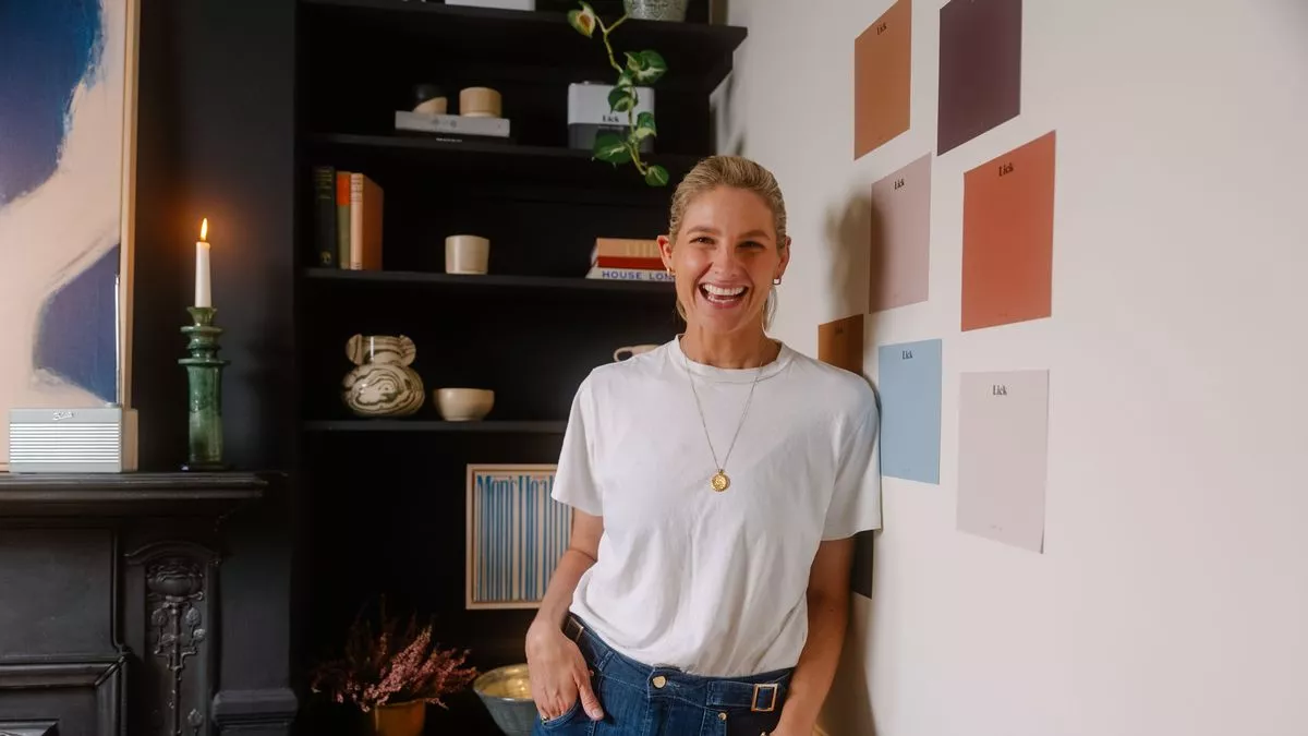
Luckily, Tash Bradley, Director of Interior Design at Lick Paint, is on a mission to make interior design accessible to everyone. Speaking to the Mirror, the leading colour expert has opened up on what colours we should consider shying away from in our bedrooms – and what colours we should opt for instead.
“I’d avoid anything with a high saturation, so that's almost like the purest colour form at its brightest. For instance, a bright fuchsia pink looks great on a small proportion like a jumper. It gives energy, but if we colour drenched a room in bright pink, you’d love it for an Instagram picture for one minute,” she said.
“But then what actually happens is it would increase your heart rate too much. It would overstimulate you and you'd be like, ‘I can't sleep in this. This is too much’.”
Instead, Tash has revealed the colours she’d opt for instead. If you’re a fan of pink within your home, staying away from highly saturated pinks doesn’t mean refraining from pink in your bedroom altogether. In fact, selecting the right shade can be ideal when creating a relaxing sleeping environment.
“If we toned it down and added a softer, earthier pink, suddenly it will have an adverse effect. Your shoulders will instantly drop. So, colours to avoid would be high saturated colour and high saturated colour that has high energy,” she explained.
“Red is one – like a really bright red. It looks lovely as a little accent, but not on your walls. I would also avoid a really bright, zesty green – a green with a lot of yellow, as well as a bright yellow or bright orange. All of those are just going to just be too much on the senses for sleep.”
Tash added: “Whereas your eye doesn't have to adjust to the color green, it’s really cool, so it's actually a very restful colour. If you went for a light, earthy green, it’d be unbelievable. That creates one of the best calming environments.”
But while Tash advises people to avoid certain colours in certain rooms due to their effect on our brains, when it comes to picking the colours of homes, it’s just as important to find what we truly love. Although looking at videos and photos on social media is a great way of finding inspiration, Tash is keen to connect people with the colours they love rather than those they’ve simply seen online.
“I’m trying to encourage people to find colours they love and that tell their story, and I don’t want people to pigeonhole themselves into a style. I’d say two to three years ago, it was very much like, you either had a modern or an eclectic style or you liked traditional mid-century. Now you can be whatever style you want. Whatever you love, we can bring that in,” she said.
“The thing that connects everything together is the colour palette. If you choose colours that you personally love and have a connection with, they will stand the test of time.”


Comments
Leave a Comment